Case Study
Jochen Schweizer Gifts
Research work and prototyping to figure out new ways for Jochen Schweizer customers to buy experiences as a gift. I introduced the design sprint method to our team, helped to create hypothesis we can validate and prototyped with sketch and xcode together with the team. Qualitative tests showed that interacting with an intelegent assistent is preferred instead of the plain old browsing throught categories way.
People struggle to find the right gift.
They often think about buying the present too late and
can't wait for the shipping
We focused on this user problem after a workshop where we got challenged to think about problems our gift buying users might have. During the Workshop we brainstormed a couple of assumptions about what could be the problem with the current system. We prioritised our assumptions so we could see which holds the most potential and has the most unknown risks. We then decided to validate that assumption within a design sprint.

We were limited to only think about a solution that would be an mobile app that helps the user buy the products already available in the Webshop. We also already knew alot about the data of our products and where it might gets hard to compare them. Tracking data also shows that users compare and scan our products a lot before they buy them.
I suggested we could tackle the challenge within an design sprint. Before we started we gathered together to formulate a couple of hypotheses what might be a solution to the problem and to figure out what we needed to learn more about.

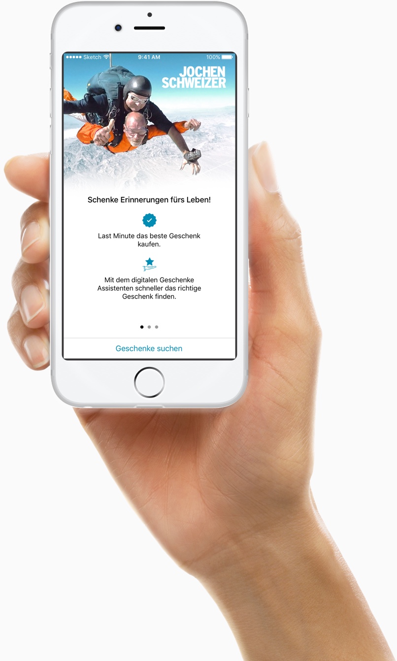
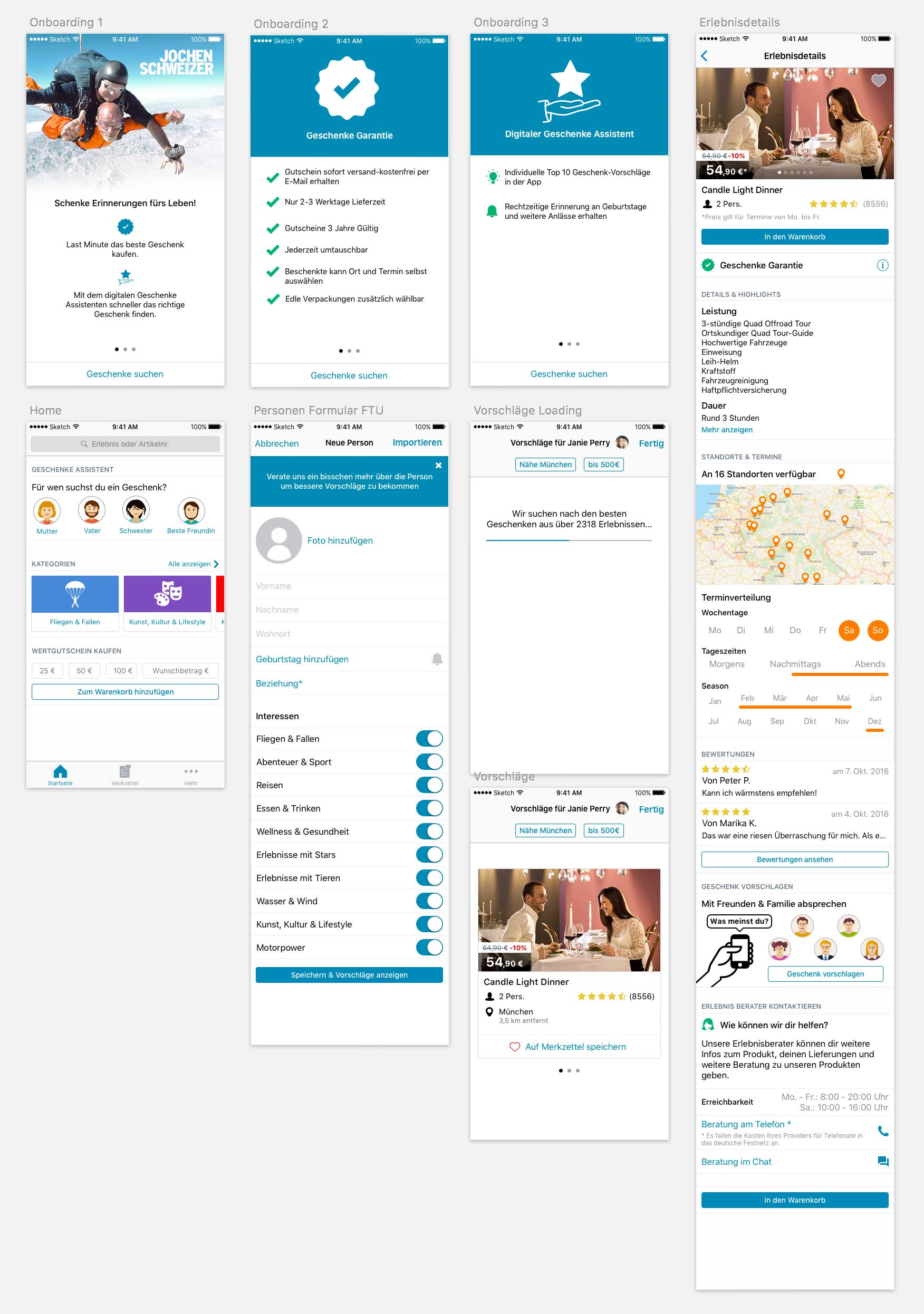
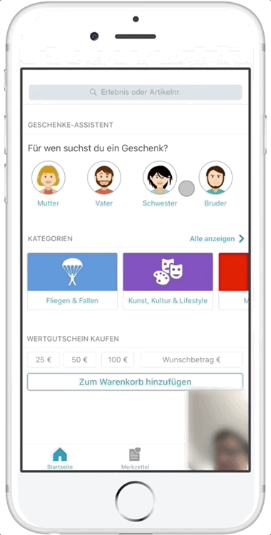
We decided to fake a new native app with a digital assistent that helps you get the perfect gift for your friends and family.
We believe that building an intelligent digital assistant who can guide you to the right gift as an alternative way to traditional search and filters will achieve faster and better results and less uncertainty about what to buy as a gift. We will know if we are right if our users turn to the assists instead of turning to traditional ways to find a gift and if users don't have any open questions once they reach a product detail screen.
On the first day we learned more about the user problem and figured out how that might change our hypothetical solution. Our guts didn't let us down, the expert interviews revealed that our assumption about the user problem is indeed very real and painful. We interviewed colleagues from our retail shops and the call center. We learned that clients often seek guidance when they want buy something for their friends and family and they often need informations they could´t find on the website. We captured all this information on a product experience map.
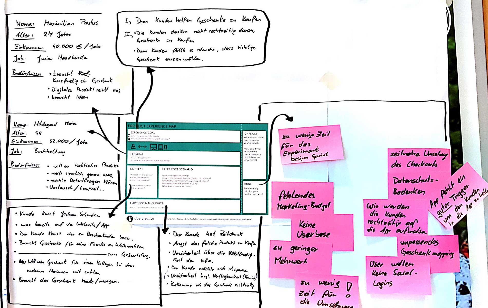
After an intense day of constructive discussions we managed to conclude on a map that shows the main flow though the product
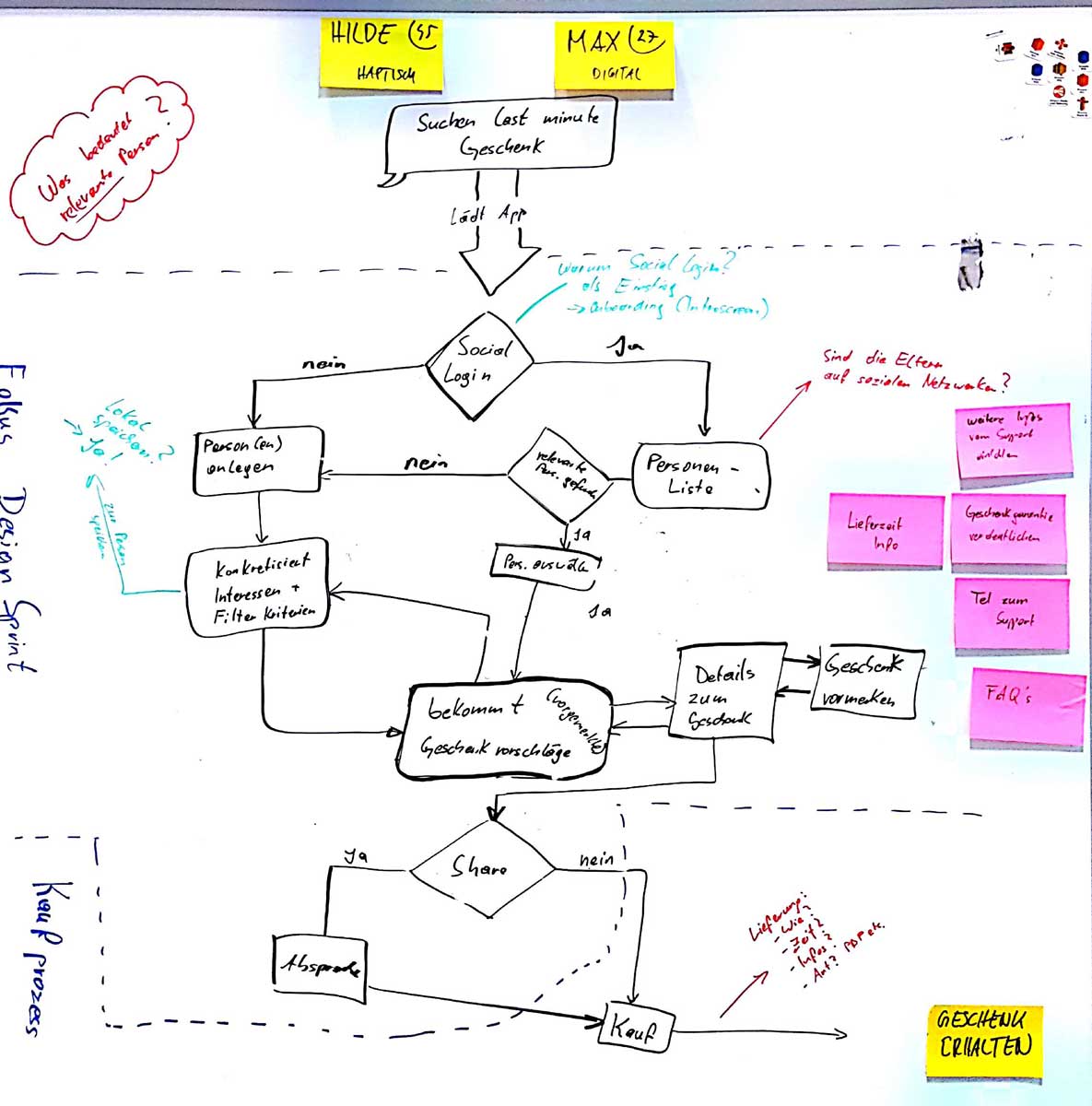
The second day was all about getting inspired by looking at other solutions and sketching possible flows.
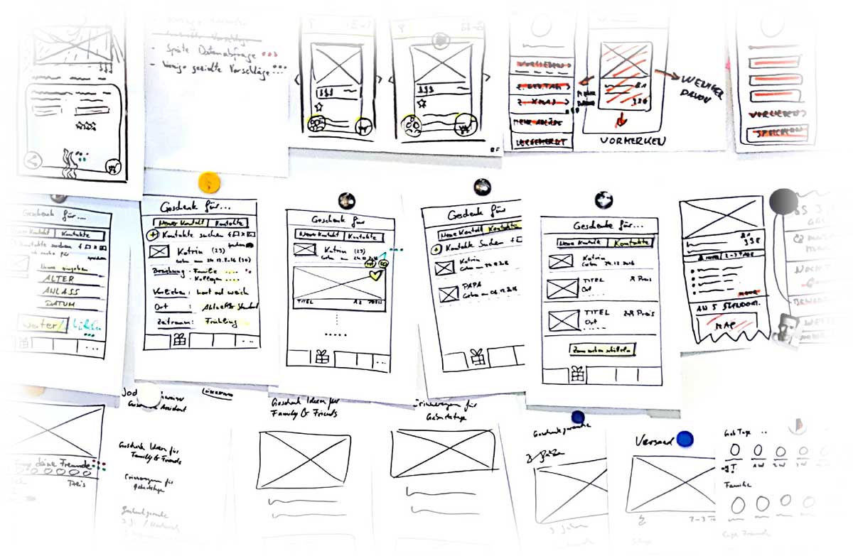
On the third day we voted for the best solutions and combined them on the storyboard. After completing the storyboard we had the blueprint for our prototype. Developers started coding the prototype, our product owner started gathering content and I started to working on the final screens for the prototype.

Day four came around and we finalised the prototype and the interview guide.
On the last day we did 6 moderated in-person usability tests.
After the test were done we discussed the results and extracted the key learnings. Also we decided what the next steps would be.
We had no glue weather people would turn to a digital assistant or rely on the traditional ways to the content. By presenting the user a home screen where he or she had all the options available and equally prominent displayed it was easy to observe the preferred way of interaction.
The user found almost all the relevant informations beside why its a good choice as a gift. People liked the fact they could suggest the gift so they could seek additional advice from there friends via chat. They also liked the fact they could easily contact the support if they needed further information.
Naturally the ux of the assistant needs refinement. Our users didn´t understand why the assistant needed that much information upfront. Their behaviour suggest that it wouldn’t be a problem to gain more information about the person a gift is searched for if the user understands what it is used for.
The user seams to expect a list but needs more guidance about the order. There must be a clear way to continue at some later point in time. Users still needs something like a wishlist to comparing products later on.
Initially we also had the idea of integrating a social login so our users could select a person they want buy a present and also so we could use the meta data to generate suggestions. Here we had to do the first big pivot, since friends meta data on facebook is only available if your friends have installed the app too.
We have discovered a very promising new way for our users to interact with the content of Jochen Schweizer. Obviously the assistant needs more refinement and also an instant digital fulfilment after purchase needs planing. More iterations are required to find answers to these questions. Also the decision was made to not start a new app but rather integrate the features for our gift buying users in the current app. We started by integrating a new tab and giving users traditional categories to look for gifts.
I set the stage for the design sprint by evangelizing and explaining the process to our product owner Markus Otte, scrum master Philipp Fuchs and the team. Before we started I also facilitated the meeting where we figured out which problem should be addressed. I wrote down the hypothesis and worked out what we needed to learn during the design sprint.
On the first day I interviewed the experts and helped to create the map.
On the second day I demoed a couple of good examples for our inspiration and scribbled a lot too :-)
On the third day I finished the storyboard by myself while the team started to code the main screens of the prototype. I also worked out most of the screens in Sketch and uploaded them to Zeplin so the devs could take it from there.
On the fourth day I finished the screens and assets for the prototype, did some dry runs und briefed my ux colleague who would do the interviews.
After the tests were done I spoke to my colleague and the product owner who did the interviews. I also analyzed the recordings and made suggestions about how to continue.
Big credits to the devs Anja Bulin, Andreas Botzler, Robin Frielingsdorf who where 100% all in from start. They came up with great hypotheses, scribbles and lean creative problem solving skills as well as focus and speed when it was time to hack the prototype together. Thanks to Markus Otte the product owner who managed to give us the freedom to experiment with this new approach and who wasn’t afraid to take the responsibility as our decider. With the help of my wonderful colleague Karina Fischer who moderated the in-person usability tests and worked out the interview guide we got unbiased results. Last but not leased Philipp Fuchs our Scrum Master was an indispensable Team Member who helped us stay on time with the tight schedule and pushed us to reach our daily goals.

Auf Instagram vloge ich als UX Einhorn zum Spaß über das Leben als UX Designer.

Auf Twitter kommentiere oder teile ich gerne hashtags wie z.B: #leanux oder #prototyping als @uxeinhorn.
Build with ♥️ by Gijora on top of Zurb Foundation humming „Done is better then perfect“.