Case Study
Spontacts Photos


Spontacts is a social network that lets users create their own activities to meet like minded people. A smoketest for uploading photos which lead to an uservoice forum, where we discussed that feature with the community, turned out to increase retention 3x after building it as a minimal viable feature.
The team was looking for new ways to increase retention in the Spontacts apps. Research showed that people tend to take photos of their Spontacts activities with their smartphones and share them on other apps.
How should Spontacts implement a way to let their users share photos between attendees and by the way increase retention?
Our guts told us that the Spontacts Community is very conscious about data privacy. We didn’t want to just copy a feature we saw on another social network :-)
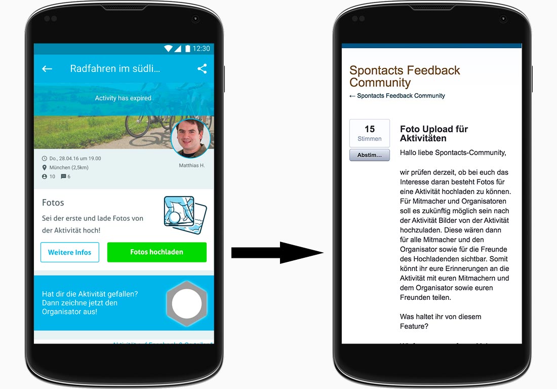
To validate our hypothesis that people would upload photos within Spontacts we decided to go for a smoketest. By designing a simple banner and tracking the conversion rate we had a method of testing acceptance and engagement. I added the idea to link the smoketest to the uservoice forum where we created a thread about this new feature so we could discuss it with the users.

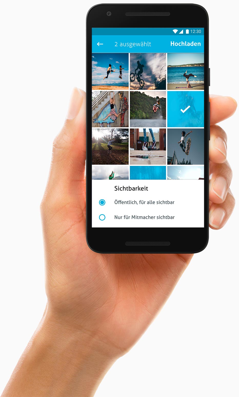
After talking to the community and a grooming meeting we had an pretty good idea how we could tackle that epic. I created a couple of more high fidelity screen designs in figma where devs and the product owner gave me some more feedback. We also decided to implement the epic on one platform only. That way we would have a chance to see how the feature changes the users behaviour before investing more energy.
Google analytics showed an increase of the interaction with activities that had photos. That motivated us to roll out that feature on all platforms.
Overall the epic resulted in a 3x higher retention on activities with photos compared to activities without photos.
By Interviewing users I have validated that activity attendees communicate on other platforms and share pictures. I suggested to launch a smoketest first to quickly get feedback from the community. I reached out to the ux community on slack and turned to quora to help our product owner define reasonable criterias for success and failure of the smoektest. I lead a collaborative whiteboard session during a grooming meeting to involve the team in the epic early on. The designs for the smoketests and final screen designs where done by me with figma.
Big thanks go out to Denise Wieslhuber who created and moderated the thread on the forum. The devs Alexander Barwig, Mario Limberger, Andreas Stark and https://www.xing.com/profile/Christian_Kiefl2 contributed alot of valuable input during the whiteboard session and also with their comments and questions on the hi-fidelity designs. I loved working with Kerstin Koch our Product Owner on this epic. She was such a great partner in orchestrating and analysing that epics outcome.
Build with ♥️ by Gijora on top of Zurb Foundation humming „Done is better then perfect“.